
The use of mobile devices to surf the Internet is growing rapidly, but unfortunately, still a big part of the web is not optimized for mobile devices. Mobile devices are often limited in size and require a different approach in terms of displaying the content on the screen.
There are a number of different screen sizes on devices such as phones, tablets, desktops, smart TVs, gaming consoles, and even smart wearable items (watches, etc.). Screen sizes tend to continue to be volatile, so it is of great importance that your website or email newsletter can be adapted to any size of screen, either today or in the future.
If you do not have responsive email newsletter, there are chances that you’re missing a lot of potential visitors and customers. You might even lose existing visitors also. Here’s why would responsive email newsletter help to attract more visitors, and what you lose if you not apply it to your business.
Availability on mobile devices
Many of your current (and potential) visitors probably accessing your site / email newsletter through mobile or other device. Responsive web design automatically adapts to different screen sizes.
If your email does not have it, it is likely to reduce the size of the text, distort images, or it will not correspond to the screen, which means it will be hard to attract potential visitors and customers who use mobile phones or tablets.
Improved user experience
Responsive design means that there is no diversion, no duplication of content, odd pages or results that look different on every platform, or not correctly translated half the text.
Responsive design translates a page with a consistent look and feel that works on all devices, thereby improving the experience that attracts more visitors and can lead to higher sales of products or services.
Optimized marketing
Every business strives to reach more customers from their target market. With responsive design, meaningfully integrate their campaigns across all media, from desktop to mobile phones, which ultimately leads to more visitors and customers.
Below you can check infographic which provides a few valuable tips on creating responsive email newsletter:

We also prepared most popular responsive email newsletter templates for you:
TORMA – Modern Email Template + Online Access
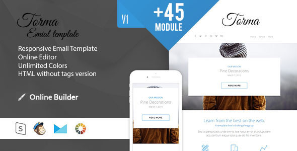
Features: Responsive Email Template. Online Access. Stamp Ready Access. Unlimited Colors. Documentation. Optimized code. HTML without tags version. MailChimp, Campain Monitor compatible. Free Support. Preview and download here.
Ferio – Responsive Email + MailBuild Online
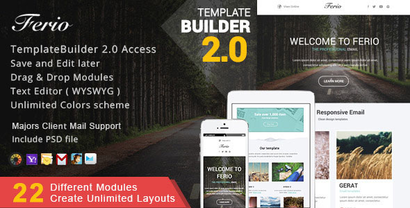
Features: Responsive Email Template in 22 different modules. Compatible with MailBuild Builder, MailChimp and CampaignMonitor ,Freshmail. MailBuild Builder Access ( New Template Builder v2.0 ). Unlimited Layouts. Unlimited Drag & Drop modular. Add & Delete modules. Save your created template to Dashboard and edit later as long as you want. Export to Desktop as Responsive HTML, MailChimp , CampaignMonitor. Send a Template Directly to your MailChimp Account. Unlimited Pick Colour scheme and changes on the real time. Works on every major email clients…and many more. Preview and download here.
Envelop – Responsive Email Template
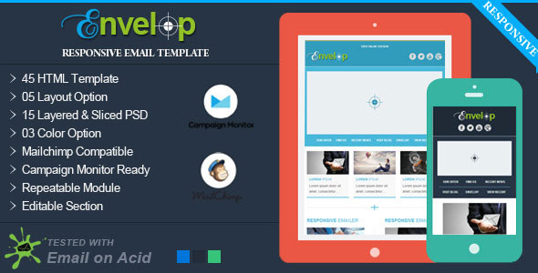
Envelop is designed with 05 great looking layout’s. It has 03 color combination’s. Total 45 HTML (15 for general uses, 15 for Mailchimp uses, 15 for Campaign Monitor uses.) along with 15 layered and sliced PSD. This will help you to promote your professional email marketing worldwide. Preview and download here.
‘Connect’ – Professional Responsive Email Template
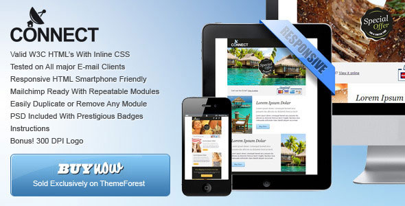
‘Connect’ is clean, super flexible and has a fully responsive design! This template sets the new design standard. its the most easy-to use email-template on the market! It have been tested on All major E-mail clients and Inline CSS used for a full cross browser compatibility. Html’s are lightweight, commented and modular which makes the job of duplicate or hide modules very easy. Preview and download here.
Dropia – Responsive Email + Themebuilder Access
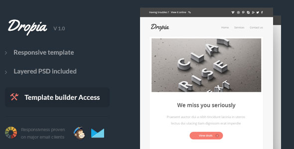
Features: Responsive Layout. Drag and drop Builder Acess included. Unlimited colors shema. Unlimited Variations. Inline Css and optimized code. Fully Layered PSD included. MailChimp Ready Template. Campaign Monitor Ready Template. HTML without tags version. Major Email Client Support. Documentation Included. Preview and download here.


