
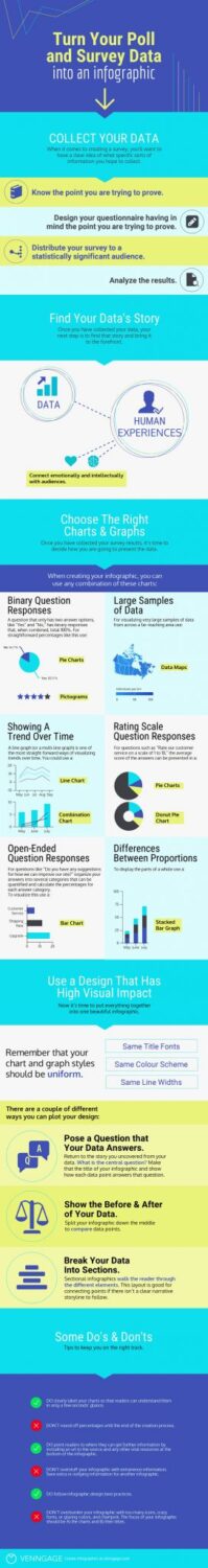
Both poll data and surveys are probably most common content types that people can see in infographic. This is because that data of survey and poll can be transformed into very beautiful and visually appealing graphs and charts. When visualizations are done the way they’re supposed to, they have the power to bring data to life. Infographics are making people easier connect with information. They can also go viral. So you’re probably wondering how you too can turn survey data and poll in shareable and beautiful infographic? What’s really important is that you collect the data. If you already go with the idea of creating survey you need to have idea what specific information you are trying to collect.
Make sure that each of those questions are somehow in correlation with the main question or point of your survey. Don’t make an extra burden with unnecessary questions. You can actually overrun it for too long and you can get less responses back. When you create survey you will have to explain why every specific data is important. So take your time to analyze it. There is story to every set of data. When you collect it, it’s time to bring that story to your audience. Story should consist of something that will connect human experiences to the data. This is lot easier if that survey has topics that can feel emotional to people. When you gathered all the results of survey it’s now time to present them. But, there’s also certain risk to visualizing data. It can be through poor design or mismanagement and unclear labeling of the data. When you want to create infographic you can combine the most common charts. They are bar graph, pie chart, line chart, pictograms, data map and stacked line graph. Pie chart is probably most in use.
When you create infographic use design with high visual impact and make sure it is rich with lots of data. The results of survey should have few different types of graphs and charts to offer full visual variety. What’s not to forget is that your graphs and charts should all be in the same uniform meaning having the same line width, color scheme and title fonts.
Dont forget to point the readers where they can get more information or even put the url link at the bottom part of your infographic. Be clear when labeling your charts so it’s easier for readers to understand even at first glance. I hope some of these tips should guide you and serve you well.


