
There are two main things that make infographics popular. First, they let your audience grasp the message easier, since they look visually appealing. Second, they are shareable and simply great. If someone tells you that infographics are so last year – don’t believe them. This type of content is on trend again. In this article, we have gathered seven amazing infographics designed by the real gurus of visual storytelling to show how amazing they can be when done well.
If you are looking for some ideas and inspiration, take a look at these images and read small tips on how to make your own infographics awesome as well.
Kelly-Moore Paints, The Sound of Color
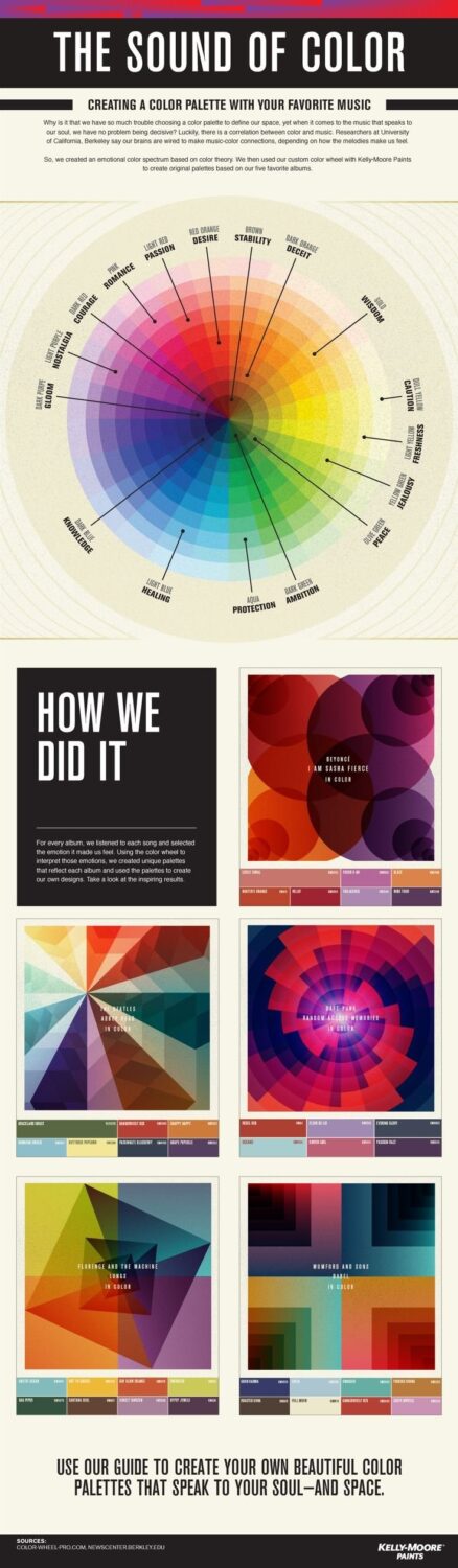
The tight connection between music and color is a well-known idea expressed by musicians, artists, and other creative people. Kelly-Moore Paints offers you to choose colors for any purpose you may have based on the music you prefer. This is a good-looking, entertaining and useful infographic that looks more like art than a guide.
Tip: This infographic shows that you can go far beyond strict marketing methods and still promote your brand efficiently. If you have no marketing tricks in your head to apply, you can always create something entertaining and visually-appealing, no matter your industry.
LinkedIn, A Well-Balanced Blog
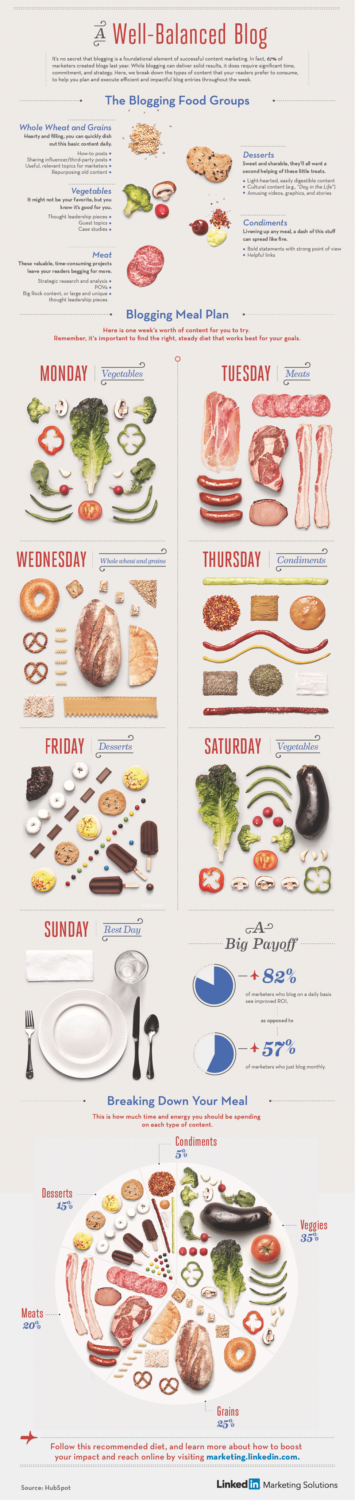
When everybody strives to create an infographic, it is essential to rise above the crowd. You should be creative and unique to attract audience’s attention. Take a look at this infographic made by LinkedIn. They did a marvelous job on creating a visual metaphor to explain the information about blogging. Using foods as an example looks extremely appealing and makes the subject simple and exciting. What is more, the photos included in the guide are professional and stylish. Is there anything better than a clear, beautiful and smart infographic?
Tip: This image shows that experiments are great and you should not be afraid to perform them. If you are used to a particular style of photography or drawing, then try another one. Also, don’t neglect such an amazing method as visual metaphor.
AppliedTrust, Boulder Is for Fun
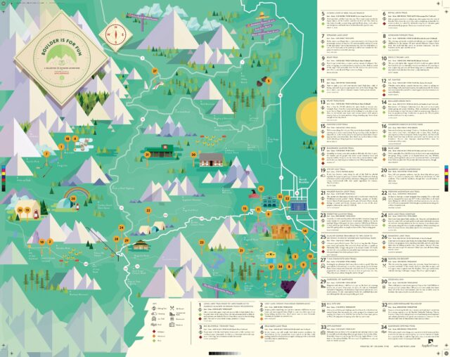
AppliedTrust has created a very stylish guide for tourists, who visit Coloradom, and if you are that type of hipster-traveler, then you will be pleased by a map like that. With a slight touch of an old-school style, this map uses appealing illustrations and beautiful colors but also provides a great resource for those, who make their way to the wild.
Tip: As you can see, there are many ways to make your content visually appealing and they are not restricted to step-by-step instructions and guides. Try different forms for your own infographic and you will certainly create something new and fresh.
Good Magazine, The Almighty Dollar
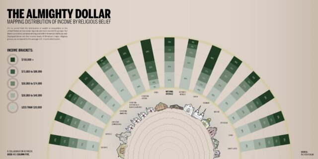
Good Magazine approaches a bit controversial topic about religious groups and their income levels by means of a clear and straightforward infographic. While the main focus of this scheme is information, the visual part stays incredible.
Tip: Infographics are perfect for explanation, especially when it comes to somewhat complicated data. You have to come up with an idea about presentation and express your findings in a comprehensible way.
Captora, Ascend to New Heights
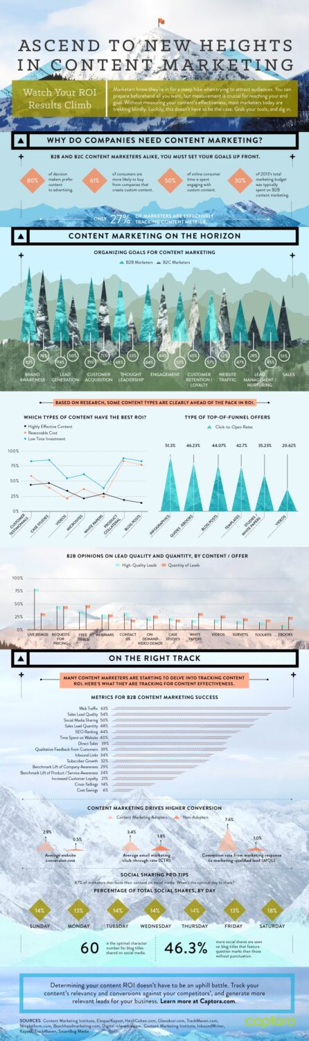
Infographics are universal when it comes to choosing a subject. Indeed, this one created by Captora is a perfect proof. The informational part is about content marketing and popular tools usually used by experts to track their campaign efficiency. As for the visual part, a combination of vector art and photos is really captivating, while the text is easy to read.
Tip: Experimenting with style combinations is nice, but don’t forget that your final result should coincide with the image of your brand. Your company or service must have a logo, style and main colors, so even if you go far beyond traditional methods of visualization, make sure that you stay on your brand and make your products recognizable.
Massive Health, Carbs Are Killing You
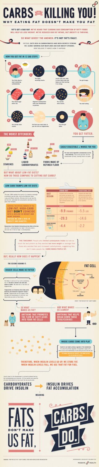
Carbs can be different and some of them are even more harmful for our health than fats. This is the theme of the infographic made by Massive Health. A simple and comprehensible design make this unobvious topic clear to the readers, even if they are not familiar with all the details connected with healthy diet. While the design looks nice, the message “Fats are not as dangerous as carbs” is delivered perfectly.
Tip: Good design is everything when you are making an explanatory infographic. Therefore, one should pay special attention to the visuals and the way they work to present facts. This image is a professional example of how text and visuals should be combined.
Digit, A Lyrical Good Time
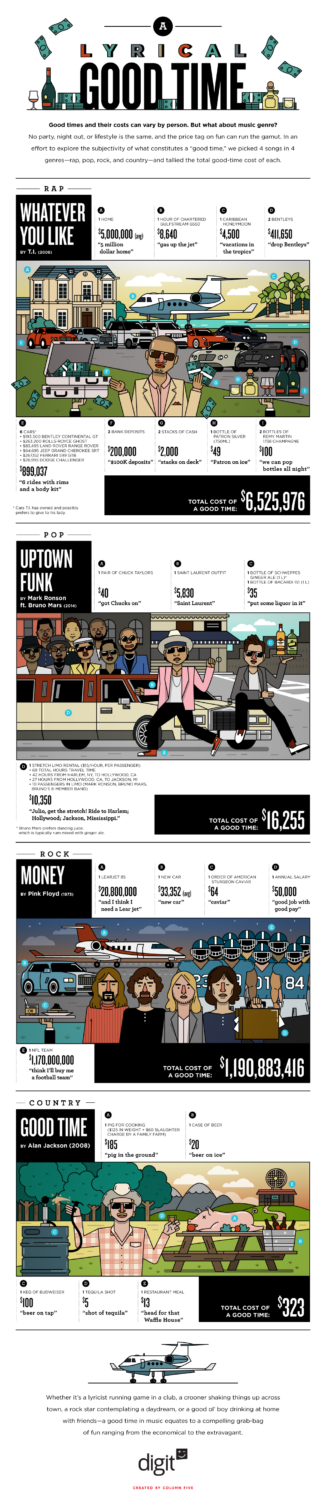
An entertaining and compelling infographic by financial company Digit tells a funny story about the cost one should pay for a “good time”, basing on the lyrics of popular songs. Illustration works perfectly to tell stories in infographics, since they are bright and entertaining. Considering the fact that the theme of this infographic is pretty humorous, funny pictures seem to be very suitable to deliver the right tone.
Tip: As you can see, even serious financial companies are not limited to boring numbers and tight topics. One should get inspiration from any source possible and produce something interesting. Entertainment is one of the main forms you can use, because everybody loves to have some fun.
How to make infographics that strike?
To make a small conclusion, we are going to list some pieces of advice on how to improve your infographics:
- Tell a story
Narrative is a very important part of every infographic. Make sure that you know what kind of message you are going to present and what tone you are going to use.
- Let the professional examples inspire you
The more compelling infographics you view, the better you will understand the secrets of the process. Look at them carefully and analyze.
- Experiment
Combine different visual styles and techniques to create something really unique.
And remember – you should perceive infographics as art of visual storytelling, not dry guidance and statistics. Good luck!


")


