
Data Visualization is the study of the visual representation of data defined as information which is conceived in a diagrammatic form, including attributes or variables for the units of information. It is a graphical representation of data, information and knowledge with the purpose of finding the relationship between them and their grouping on the basis of similarities or some other measures. Today are most used different types of diagrams, tables, charts and graphs or mental maps.
The main goal of data visualization is effective communication of clear information through graphical means. For effective transfer of ideas, aesthetics and functionality should together provide an insight into the narrow area of complex data sets. However, designers often fail to strike a balance between design and function. Creating a “rich” data visualization does not serve the initial and the main aim – which is communication of information.
Why is the data visualization better?
90% of the information that coming into our brain are the visual character, and more than 45% of users prefers more visual information than plain text when learning or mastering specific tasks / subjects. This is one of the main reasons why more than 65% of the population relies on visual information instead of reading plain text.
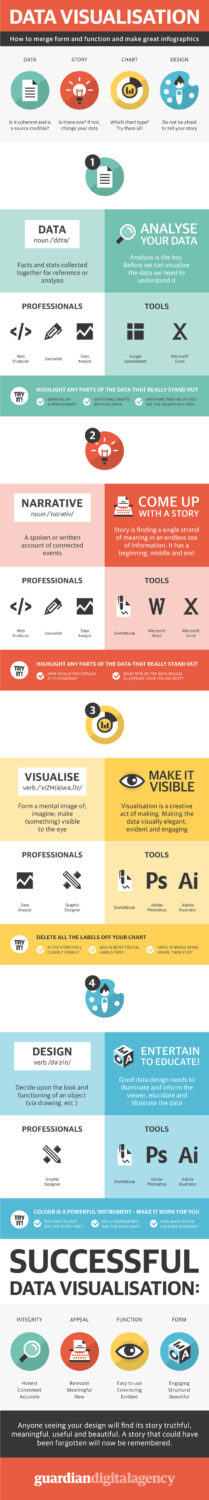
Below you can check infographic with data visualization tips which will help you to merge form & function and make great infographics:


")


