
In the multitude of products on the shelves of stores is often difficult to manage and decide. But surely it happened to you have chosen a product that has the most beautiful packaging. This is not surprising, because first we see colors, and each color has a certain effect on the us.
When launching new products, designers do not choose the color randomly, but to communicate a certain message on the product itself. According to research even the 80 percent of visual communication is associated with colors. Besides choosing the color, it is also important packaging design that should be appealing to us and make product recognizable.
Red for fun, gold for expensive items
Packaging in stronger color suggests that it is a food or drink with stronger taste and lighter color is used for products with fewer calories. Color of aggression, red stimulates appetite and we first observe red color. The color red is often featured in products associated with fun (Coca-Cola, McDonalds). The green color of the packaging suggests that it is a healthy product for people, but also acceptable for environment.
Purple is for packaging products rarely used, and when designers use it they want us suggest that it is a special product and worth buying. The yellow color is most often used as the background color for text. The orange color is used for products that are not expensive. Black wants us to suggest that these are products that are elegant. White is the color of purity and neutrality, and often as the yellow used for the background to make the text more pointed.
Products in gold, want to suggest that the product is especially valuable. The blue products inspire confidence and encourage a sense of responsibility.
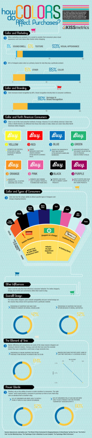
Below is infographic with more info about how colors affect purchases:


")


