Did you know that colors can influence on people thoughts and behaviors when buying and using something? Take a look at your clothes for example. Most of the people find colors very important when buying shirt or pants and color of them can be very important for different occasions. For example, you will probably wear black to funerals (or death metal concerts), colorful shirt during summer or some elegant dress or suit to wedding. That means if you own some clothes shop you will have to be familiar with every color and what it does. The same things stands for online sales too. If you own some company or your work as marketing expert then this article should be very helpful to you and you will understand what colors can help you to achieve your goal and sell more products.
Color importance
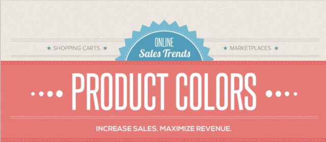
If you read everything I mentioned above then you can probably understand why colors are so important in marketing and business. But its importance is much larger. The main use of colors are to create branding of company. Just like I mentioned in the first paragraph, colors can affect your thoughts and behaviors and that includes your emotions too. Some studies showed that if a person doesn’t exactly know what to buy, over 90% of people will make their choice based on the color. And it is also confirmed that people can make their judgment about some brand just by its color. What does that mean? Well, it means that you must pick the right color. The most important thing is to predict how customers should react to different colors of the product. Another thing where color is very important is when you decide for which gender your product will be. Have you ever wondered why there are no purple power tools? Each gender prefers different styles and colors. Here are the results from most popular studies about gender favorite and least favorite colors. Studies say that the favorite men’s colors are blue (57% of men like it), green (14%) and black (9%). Women also like the blue color (35%) the most, and it is followed by purple (23%) and green (14%). On the other hand, men really don’t like brown (27%), orange (22%), purple (22%) and yellow (13%). The least favorite colors with women are again orange (33%), brown (20%), grey (17%) and once again yellow with 13%. Here are the complete charts:
As you can see both genders really love blue color while there is a large difference between purple color with men and women. Another thing that is really important to know is that men and women like different shade, tint and hues of colors too. For example, men prefer bright colors while women like soft colors more.
When you come to the point where you have to decide which colors to use always remember everything above because it is important to pick the right colors for both genders.
What some colors present
Another way to decide what color to use is to actually understand what each color means. Every color has its own meaning and effect on people. Of course that effects maybe won’t be the same with each person but it will be the same with most of the people. Here are the 8 main colors explained.
- Red
The first color on our list is red, often called as power color. Red is probably the most popular color used in sales because it attracts attention, creates urgency and even raises energy sometimes.
- Blue
The most popular color with both genders is second on our list. The reason why lots of people use blue with their products is because this color creates the feeling of security and trust. If you look at the advertisements of banks and financial companies you can often notice the domination of blue color.
- Green
Money is green, right? So it is not weird that green color is mostly associated with wealth. But green color is also very relaxing and warm and it is often used for environmental ads and products.
- Pink
Pink is mainly used for feminine products. It is funny and yet very romantic and that’s why it is used for product that needs to attract women and young girls.
- Black
Black is another color that can be a really powerful marketing trick if used well. It is very powerful and it is often used for luxury products.
- Purple
Don’t confuse purple with pink, those are different colors. They look similar but each color can cause different effects. Purple color is calm and it is often used for beauty products.
- Yellow
Even though yellow is not one of the most favorite colors with both genders it is still used a lot in marketing. Why? Because it is very powerful and attracts a lot of attention. People who learn how to use yellow color on right way will be able to show their confidence to everyone.
- Gold
The last color on our list is gold. It is powerful but yet very elegant and it also presents wealth, just like green color.
Contrast
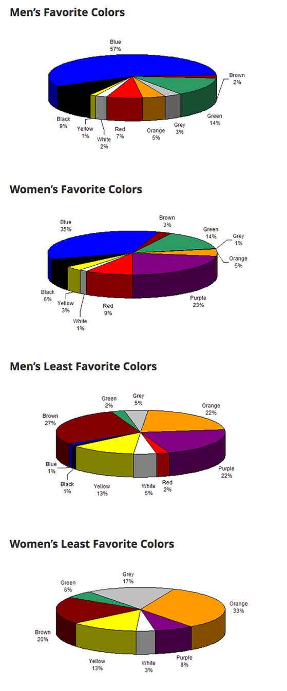
It is not enough just to pick the right color, you have to know how to use it and when applying the right color you have to pay attention to contrast. What is contrast actually? We can define it as the stuff that makes the difference between some text or object and the background. There are two types of contrast:
- High contrast – colors are far from one another. High contrast is the best choice for important content that should be easily noticed (dark stuff on light background or light stuff on darker background).
- Low contrast – colors are very similar. Designers love to use low contrast because it can look very nice. But, this solution is not always good for reading. If you decide to use low contrast then apply it on some irrelevant content.
Most people think that the contrast is actually the difference between colors. That is not true, not always. How? Well, you can use two different colors but they don’t have to be in contrast because their tone is the same. You probably know that basic colors are yellow, red and blue. If you add other colors to that basic ones you get other colors like green, purple, orange and similar. Which means that you can get red (basic color) and orange (color you got), the two colors that are different but still they have little contrast. Example:
So now you know what contrast can do. But don’t overuse it. You have to know when to use contrast. If you need to put some special attention to an object of your page then use contrast, in other cases you could just ruin something with adding contrast. How to recognize where to add contrast? Decide what the primary focus of your page is. If you want to make people subscribe then your subscribe button should be in the focus. If you want to attract user attention to some product then apply contrast to most important features of your product to get all the attention there. You got it know? Well, great.
And that’s it for now. I hope you learned something more about colors and that now you know not to design purple power tool or apply lots of black color to your “save the earth” campaign. You can also find out some more interesting things about product colors in the infographic below.